Logo animation breathes new life into a brand’s identity in a way still images and flat text can’t. Sometimes even just a few frames of animation can engage our audience and can create that extra attention. Take a look at some of our favorite animated logo techniques and learn why they’re so effective.
Animated logo techniques
The Morph
This style keeps the viewer guessing. A morphing logo animation can become absolutely anything, and just when someone thinks they know what they’re seeing, you can jolt them back to attention with a new look.
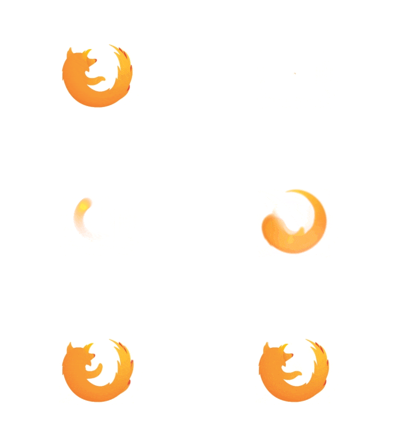
This animated version of the Firefox browser logo turns a swirling blur into a relaxed animal mascot. Morphing weaves action, mystery, and recognizable branding to keep people interested longer than a still logo can.
Here are some other examples of the morph logo animation:

The Pulse
If you’re thinking about Shazam, you’re probably thinking about music, and the pulsing glow brings to mind a high-energy beat. By bringing the logo to life with the very thing that drives Shazam, it appeals to music lovers even more.
Here are some other examples of the pulse logo animation:
The Spell-Out
How do you animate a plain-text logo? Simple: Spell it out and give it a flourish. The flowing font and the gliding ink drop are so soothing you want to watch it loop, which is why designers Untime Studio chose it for their blog. Fiverr doer hectorromero198 has some other great examples of this technique in his portfolio.
Here are some other examples of the spell-out logo animation:
The Negative Space
Skype’s logo animation forms in negative space as bubbles fly in and cluster together. It’s surprising and creates an engaging experience for users. For another cool version of animated negative space, see Fiverr Pro animteam’s Matthew Noah logo.
Here are some other examples of the negative space logo animation:
The Intuitive
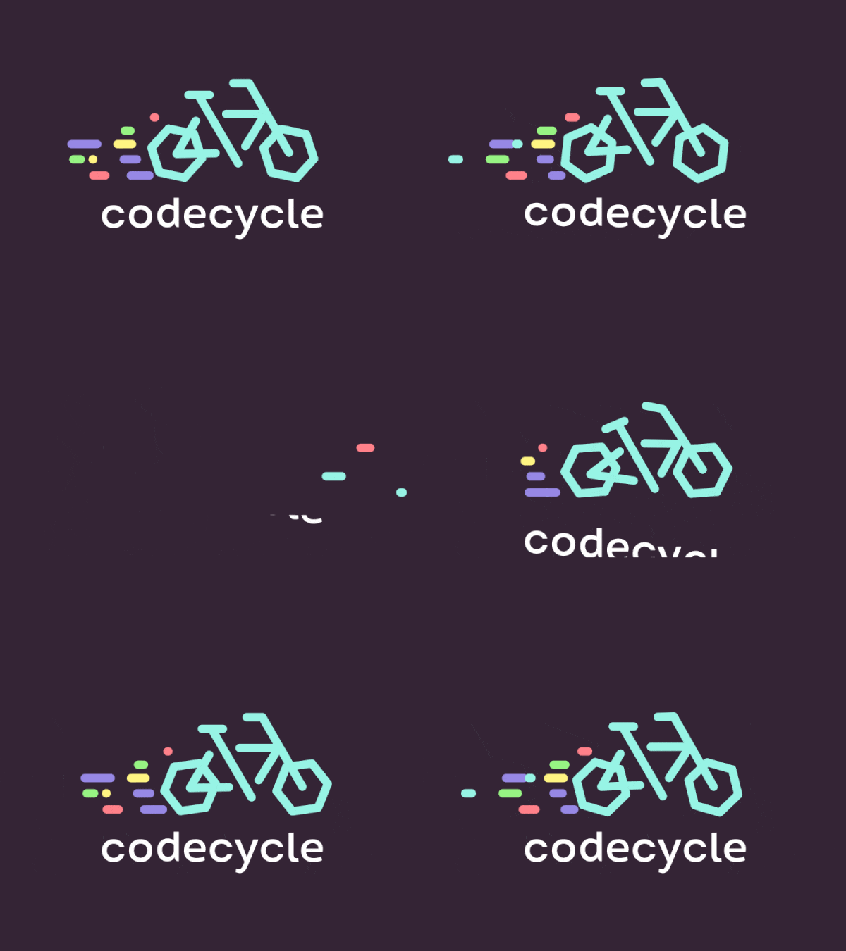
This speculative design for CodeCycle, an energy-efficiency app for building designers, takes pride in showing real-world objects with real-world animation. It’s a useful reminder that a dog with a wagging tail, a candle with a flickering flame, or a bicycle that jets across the screen can be perfectly satisfying.

Here are some other examples of the intuitive logo animation:
The Storyteller
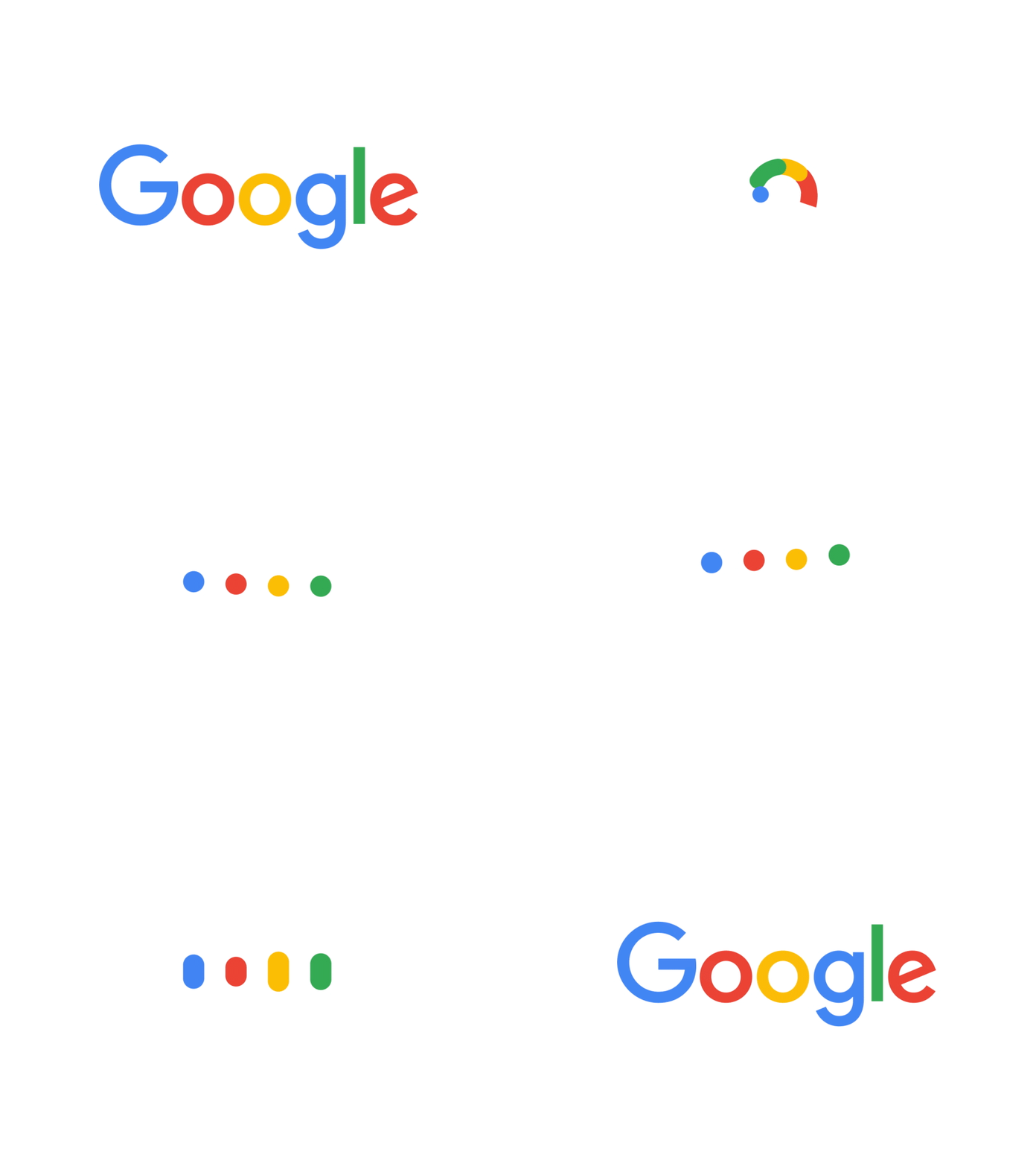
Google’s got its fingers in a lot of pies, and this animated logo tells that story in a bright, energetic and lively way. The colors are bold and bright, the dots hop happily, and the icons remind you of core Google services. Google’s homepage puts on animation masterclasses almost daily with the Google Doodle.
Here are some other examples of the storyteller logo animation:
The Cartoonish
Cartoonish animations reach the kid in almost everyone, conjuring fun and whimsy and making a brand’s presence lighter. This animated LinkedIn logo shows the business networking site has a sense of humor about the work world. Getting trapped in your own briefcase could be terrifying, but the bright, bouncy style keeps the viewer smiling.

Here are some other examples of the cartoonish logo animation:
The Elegant
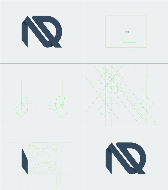
Public relations is a complicated and crowded field, and so image really matters. Los Angeles-based Flight PR reassures clients that it’s a cool, calm, and collected organization with an elegant animated logo designed around clean lines and smooth flow. These logos sometimes use an endless loop technique that implies stability and consistency. For another take on elegance, check out Fiverr doer vicasso’s Alberto Garcia logo.

Here are some other examples of the elegant logo animation:

The Hand-Drawn
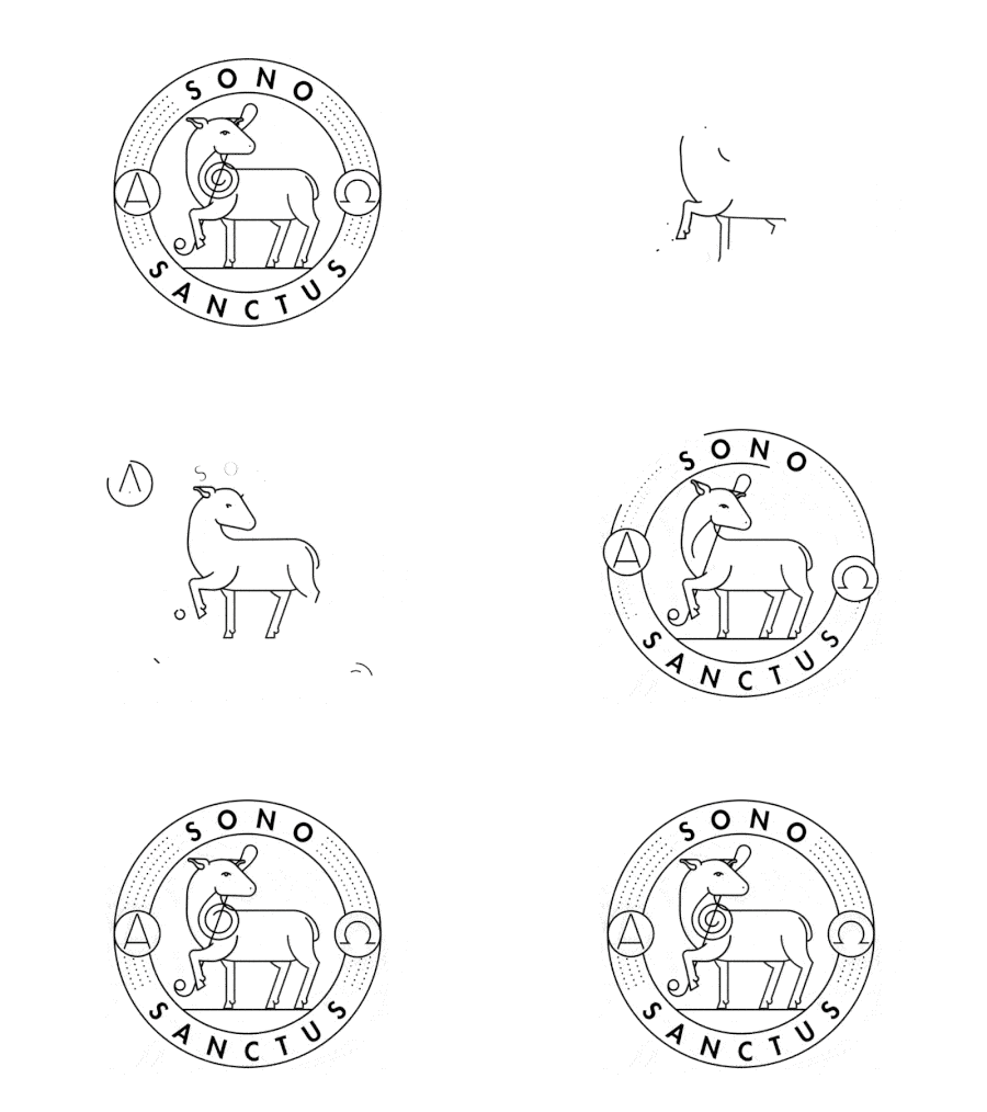
Audio design firm Sono Sanctus connects with visitors via this clever animated logo. You could be seeing the work of a skilled freehand artist working at high speeds, and it’s that throwback connection to traditional pen-and-paper methods that make hand-drawn logos so interesting. Whether the hand-drawn style is full of clean, precise lines or rough pencil marks, that taste of the physical world puts these logos in a special class.
Here are some other examples of the hand-drawn logo animation:
The Reveal
The power of a reveal animation isn’t just what is uncovered but how the picture comes together.
FedEx Logo Animation

As the FedEx logo takes shape, the whooshing arrows (you can practically hear them!) promise jet-propelled service. They precisely carve out each section with timely and on-target delivery. It’s exactly what FedEx is trying to say about itself.
Here are some other examples of the reveal logo animation:
Uber Animated Logo
The Three-Dimensional
For a generation of old-school gamers, the brief twist of the letter N rising up when the Nintendo 64 was turned on promised excitement. This reconstruction turns it into a perpetual motion and excitement machine with just 15 frames.

Need an Animated Logo for your Brand?
Don’t Forget to Share this Post!
